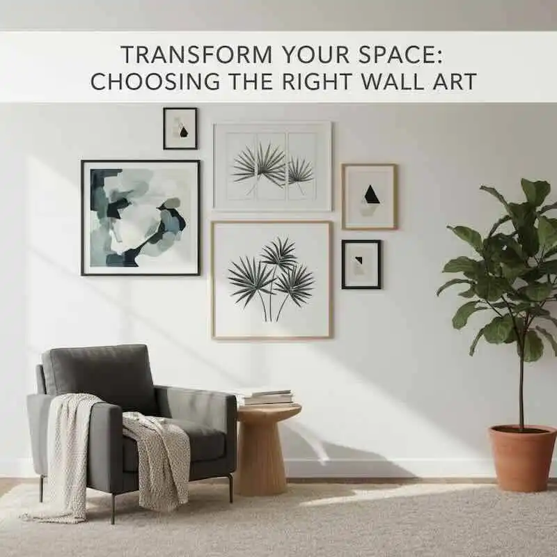
Just selecting the right wall art can transform your living space, adding personality and balance without overwhelming your existing décor. You want pieces that enhance your room’s colors, textures, and overall style while fitting naturally within the space. By focusing on aspects like scale, function, and meaningful content, you can confidently choose artwork that complements and elevates your home. This guide will help you navigate the many options so you can create a cohesive and inviting atmosphere that truly reflects your taste.
- Decoding Your Color Palette: The Key to Harmonious Choices
- Style Alignment: Art That Resonates
- Scale Matters: Finding the Perfect Fit
- Creating a Focal Point: Captivating Visuals
- Harmonizing Textures and Materials
- Function-Driven Art: Purpose Meets Aesthetics
- The Personal Touch: Infusing Meaning into Your Space
- Conclusion
- FAQ
Key Takeaways:
- Consider the room’s color palette and décor style to select wall art that naturally enhances the overall aesthetic.
- Pay attention to scale, proportion, and visual balance to ensure the artwork fits harmoniously within the space.
- Incorporate meaningful pieces and use wall art strategically to create focal points that add personality and cohesion to your home.
Decoding Your Color Palette: The Key to Harmonious Choices
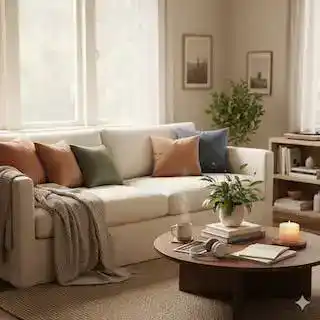
Identifying the nuances in your room’s color palette helps you select wall art that blends seamlessly rather than competes. Observing dominant and accent hues allows you to pick artwork that either mirrors these tones or introduces contrasting yet complementary shades. For instance, in a living space featuring soft blues and grays, artwork incorporating warm copper or burnt orange can add vibrancy without disrupting harmony. Leveraging your palette as a guide creates a balanced visual flow, making your wall art feel like a natural extension of your décor.
Analyzing Existing Colors
Survey your room by noting main colors in walls, furnishings, and décor items, including secondary and tertiary shades. Pinpointing cooler or warmer undertones provides clarity—like distinguishing whether your beige sofa leans yellow or gray. This detail influences which art colors will enhance rather than clash. Digital tools or room photos can simplify this process, enabling you to isolate key hues and understand their relationships. A thoughtful color analysis prevents mismatches and ensures your wall art complements existing design elements effortlessly.
Selecting Complementary Tones
Choose hues that either echo your palette or balance it through contrast by referencing the color wheel. Pairing blue walls with orange accents or olive greens with soft pinks intensifies interest while maintaining visual unity. Subtle shifts like muted pastels or deeper jewel tones can add depth without overwhelming your space. Ultimately, matching wall art colors to those already present or thoughtfully contrasting them imbues your room with cohesion and dynamic appeal.
Upon further examination, complementary tones utilize the principles of color theory to simultaneously create harmony and energy. You might select a deep navy piece to anchor a room painted in soft peach, allowing the artwork to stand out while tying back through shared warmth. Alternatively, analogous colors—those adjacent on the color wheel like teal, aqua, and moss green—build a serene, layered look when reflected in your art. Experiment with saturation and brightness too: a high-contrast, richly pigmented print can energize a neutral room, whereas softer shades keep a tranquil vibe intact. These calculated choices influence mood, balance, and the immersive feel of your space, transforming walls into thoughtful statements rather than mere decorations.
Style Alignment: Art That Resonates
Choosing wall art that truly resonates with your home’s aesthetic enhances visual harmony and strengthens your design story. Aligning your artwork with the established style—whether modern, rustic, minimalist, or eclectic—ensures each piece feels intentional rather than random. Integrate textures, colors, and motifs that echo your décor’s mood. Artwork with geometric shapes complements modern interiors, while botanical prints or vintage maps elevate traditional settings. By selecting art that reflects your personal style narrative, you create continuity that invites onlookers to experience your space as a coherent, thoughtfully crafted environment.
More Read

Identifying Your Décor Style
Start by cataloging your space’s dominant design elements—clean lines point to contemporary, distressed wood suggests rustic, and open, airy layouts often indicate Scandinavian influence. Assess colors, furniture shapes, and patterns you consistently incorporate. This framework helps you pinpoint whether your décor leans minimalist, bohemian, industrial, or another style. Understanding this foundation lets you narrow art choices to those that naturally complement rather than compete with your existing arrangements.
Finding Art That Mirrors Your Aesthetic
Once your style is clear, seek art that echoes its defining traits. For example, sleek metal sculptures or black-and-white photography harmonize with modern themes, while impressionist landscapes enhance classic interiors. If you favor a coastal vibe, look for seascapes or driftwood frames. Abstract art with organic shapes can amplify bohemian spaces. Matching your artwork’s vibe to your décor’s essence reinforces the room’s character and creates a seamless visual flow.
Diving deeper, consider mediums and motifs that naturally align with your aesthetic. Minimalist décor thrives on monochromatic prints or simple line art that echo its uncluttered ethos, whereas eclectic spaces welcome bold colors and mixed media for dynamic contrast. Reflect on the emotional tone your décor sets—calm and serene or vibrant and energetic—and find artwork that channels that feeling. Galleries, artisan fairs, and online platforms often allow filtering by style and theme, making it easier to locate pieces that truly mirror your home’s personality and complete the look without overpowering it.
Scale Matters: Finding the Perfect Fit
Choosing wall art that fits your space perfectly can transform a room’s atmosphere. Consider the dimensions of your walls and surrounding furniture to avoid pieces that either disappear or dominate awkwardly. In a living room with a large sofa, artwork spanning around two-thirds of the sofa’s width creates a harmonious visual relationship. Smaller spaces benefit from intimate-sized pieces or thoughtfully arranged clusters. Using mock-ups or tape to outline potential art dimensions on your walls can help you envision the balance before committing to hanging anything.
Understanding Size in Relation to Space
Art that’s too small on an expansive wall often feels underwhelming, while massive artwork in compact rooms can overwhelm and shrink the perceived space. You want the artwork to complement, not compete with, your room’s dimensions. For example, a 30×40 inch canvas may be perfect above a king-sized bed but excessive in a narrow hallway. Matching the scale of your wall art to both the empty wall area and the adjacent furnishings ensures a comfortable, cohesive feeling throughout.
Using Proportion to Create Impact
Keeping proportion in mind helps your wall art attract attention while maintaining room harmony. Aim for pieces that relate well to surrounding objects—for instance, a painting two-thirds the width of a sofa draws focus without overpowering. Arrange groups of smaller artworks in a way that their combined size creates a balanced shape, thoughtfully filling the space. Correct proportion turns your wall into a carefully curated gallery rather than a random display.
Diving deeper, proportion involves more than just width measurements; it’s about how height, shape, and arrangement interact with the room’s architectural elements and furniture. For example, vertical art pieces emphasize height and work well in rooms with tall ceilings, while horizontal formats echo the lines of couches or credenzas. When designing a gallery wall, consider negative space carefully—spacing pieces evenly and allowing breathing room enhances cohesion and impact. Experimenting with layouts on the floor beforehand can reveal the most striking and balanced configurations.
Creating a Focal Point: Captivating Visuals
Establishing a captivating focal point with wall art transforms your room by directing attention and adding intentional style. Placing a visually striking piece where it naturally draws the eye—like above a mantel or at the hallway’s end—creates an anchor for the space. Whether you choose a vibrant abstract or a dramatic black-and-white photograph, bold choices create a significant impact and harmonize the room’s decor. This central artwork fills space and invites viewers to linger, giving your design a polished and purposeful finish.
Strategically Placing Art to Draw Attention
Position art where it can effortlessly engage visitors: at eye level and in natural sightlines. For instance, you can guide the flow through your home by centering a large canvas over a sofa or aligning a series of smaller framed pieces along a staircase wall. Lighting further enhances impact—adjustable spotlights or picture lights focus on the piece, intensifying its presence. Thoughtful placement ensures your wall art commands the room without being overwhelming, balancing prominence with harmony.
Utilizing Bold Choices for Maximum Effect
Choosing art with vivid colors, striking contrasts, or oversized scale amplifies a room’s personality instantly. An intense red canvas or a dramatic black and white photograph can energize neutral walls and reinforce your design’s mood. Textured or mixed-media works also add depth, breaking the flatness of typical wall surfaces. Selecting bold pieces signals confidence in your style and invites conversation, turning your wall into a dynamic expression rather than mere decoration.
Bold art captures the eye and shapes the character of the room. For example, a 6-foot-wide abstract painting with saturated blues and golds can create a luxurious atmosphere in a living room, while a large monochrome portrait lends sophistication to a minimalist space. Layering bold art with complementary textures—such as metallic frames or wooden accents—enhances tactile interest, preventing visual overload. Consider the emotional impact too: a dramatic piece can energize social areas, whereas darker, subdued, bold art can add intimacy in lounges or bedrooms. By balancing scale, color, and texture, bold choices become powerful design tools that elevate your entire décor scheme.
Harmonizing Textures and Materials
Your wall art gains depth and interest when it resonates with the textures and materials already in your room. If you have a space defined by rough-hewn wood, linen upholstery, or stone accents, choosing artwork that features natural fibers, woven canvases, or rustic frames can pull everything together. Conversely, in spaces with glossy finishes or metal fixtures, crisp, sleek art pieces in metallic frames or acrylic prints enhance the modern vibe. This alignment of tactile elements ensures your artwork doesn’t feel like an afterthought but part of a harmonious design story.
Blending Different Textures for Depth
Layering textures through your wall art adds visual dimension, creating a richer environment. Combining smooth glass frames with rough jute mats or incorporating mixed-media pieces that fuse paper, fabric, and paint invites touch and curiosity. For example, pairing a soft, woven tapestry alongside a glossy photographic print can balance warmth and sheen. Such thoughtful contrasts engage the senses and prevent walls from appearing flat or dull, elevating your décor’s complexity with subtle yet effective texture interplay.
Choosing Art That Enhances Natural Materials
Art reflecting or complementing natural materials deepens a room’s organic atmosphere. You might select canvas prints with earthy palettes featuring greens, browns, and ochres to echo a wood-paneled wall or linen sofa. Frames crafted from reclaimed wood, bamboo, or cork amplify that natural feel. Pieces showcasing botanical illustrations or serene landscapes also link directly to nature, reinforcing the tactile and visual warmth provided by natural elements already present in your décor.
Expanding on this, incorporating artwork that mirrors the qualities of natural materials further enriches your space. For instance, a large canvas print of a forest scene with layered textures can mimic the uneven grain of wooden floors, while a handmade paper collage introduces raw, fibrous texture akin to woven textiles. Selecting frames made from sustainable materials like reclaimed timber or bamboo adds authenticity and environmental mindfulness. This synergy not only enhances the natural components of your room but also creates a cohesive, soothing environment that invites relaxation and connection with the outdoors.
Function-Driven Art: Purpose Meets Aesthetics
Your wall art should resonate with how you live and use each space, blending purpose with visual appeal. Selecting pieces that echo a room’s activity elevates the décor and enhances the room’s functionality. For instance, soothing landscapes or abstract blues suit bedrooms, creating a restful atmosphere, while dynamic, colorful art injects energy into social spaces like living rooms. Matching art to the vibe and intended use of each room ensures your walls contribute meaningfully, rather than feeling like mere decoration.
Matching Art to Room Purpose
The art you choose can amplify a room’s role: motivational prints or minimalist photography sharpen focus in a home office, while playful food-themed or quirky designs enliven kitchens. Living rooms welcome bold pieces that start conversations, whereas bedrooms call for calming, understated works. Aligning artwork with each room’s daily function helps cultivate the mood you want to foster, turning art into a subtle yet powerful complement to your lifestyle.
Tailoring Choices to Lighting and Utility
Consider how lighting and room use affect your art selection. A well-lit dining room can handle glossy, reflective acrylics that play with natural light, while a dimly lit hallway benefits from bright, high-contrast pieces to enliven the space. In frequently used areas, durable materials like canvas or metal frames withstand wear better than delicate paper prints. Adjusting your wall art to lighting conditions and practical needs ensures your choices look impeccable and endure daily life.
Natural and artificial light dramatically shift how art appears; bright daylight can wash out subtle hues, so choosing pieces with vibrant or strong contrasts maintains impact throughout the day. In contrast, soft or indirect lighting suits muted palettes and textured finishes that add warmth without glare. Utility factors like traffic patterns or exposure to moisture also shape your choices—metal or acrylic frames resist damage in kitchens or entryways better than fragile glass. Thinking through these lighting and functional dynamics positions your art not just as decoration but as an integral, resilient element of your interior design.
The Personal Touch: Infusing Meaning into Your Space
You can deepen the connection to your home by selecting wall art that tells your story, such as travel snapshots from a favorite destination or vintage pieces inherited from family. A study found that integrating personal items boosts emotional well-being and comfort in living spaces. Consider showcasing artwork from local artists to reflect community ties or incorporate custom commissions that echo your interests. These meaningful pieces not only enrich your décor but also become authentic conversation starters, making your space feel genuinely yours while harmonizing with existing colors, textures, and styles.
Conclusion
Drawing together the key ideas, choosing wall art that complements your existing home décor becomes an enjoyable and rewarding process when you focus on your room’s color palette, style, scale, and function. By selecting pieces that balance visual weight, create focal points, and hold personal meaning, you ensure your artwork enhances your space and reflects your personality. With thoughtful consideration, you can transform your walls into a harmonious extension of your home’s design, making your space feel complete and uniquely yours.
FAQ
Q: How can I ensure my wall art complements the color palette of my room?
A: Start by observing the dominant and subtle colors already present in your room, including walls, furniture, and accessories. Choose artwork that incorporates similar tones or hues that harmonize with the existing palette. For instance, warm colors like terracotta or mustard work well in cozy kitchens. Using online tools or viewing art samples with color details can help you visualize how the piece will blend with your décor, ensuring a seamless and enhanced look.
Q: What should I consider when selecting the size of wall art for a specific space?
A: The size of your wall art should be proportional to both the wall and the furniture near it. For example, a piece hung above a sofa or bed typically looks best when it measures about two-thirds to three-quarters of the furniture’s width. Avoid placing artworks that are too small on large empty walls, as they can appear lost, or using overly large pieces in small rooms, which may feel overwhelming. Planning layouts with templates or measuring the wall space beforehand can help achieve a balanced and visually pleasing arrangement.
Q: How can I use wall art to create a focal point in a room?
A: Choose a piece that naturally draws attention, such as a bold painting, a colorful abstract, or a striking black-and-white photograph, and place it where it can serve as the centerpiece—above a fireplace, at the end of a hallway, or above key furniture. This focal artwork can anchor the room’s design, give it character, and guide the arrangement of other décor elements around it, resulting in a more intentional and complete space.