




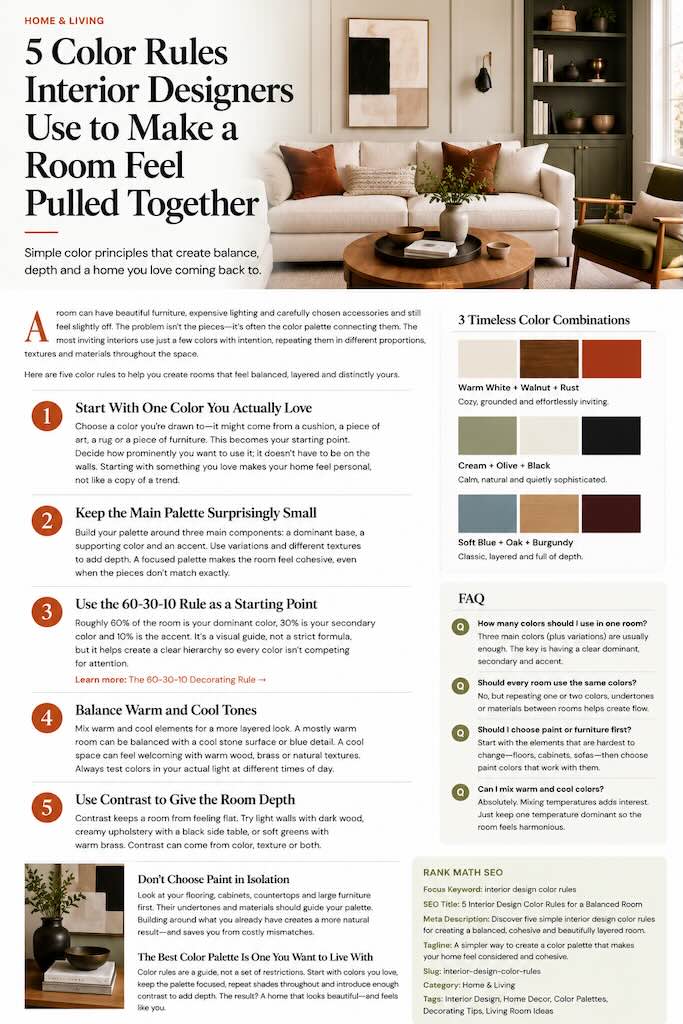
A room can have beautiful furniture, expensive lighting and carefully chosen accessories and still feel slightly off. Often, the problem isn’t the individual pieces. It’s the color palette connecting them.
The most inviting interiors rarely rely on dozens of perfectly matched shades. Instead, they use a small number of colors with intention, repeating them in different proportions, textures and materials throughout the room.
You don’t need to follow rigid decorating rules to make this work. Think of the following five principles as a framework for creating rooms that feel balanced, layered and distinctly yours.
1. Start With One Color You Actually Love
Before looking at paint charts or scrolling through perfectly styled rooms, start with something much simpler: choose a color you genuinely want to live with.
It might be the rust of a favorite cushion, the olive green of a vintage chair, the warm brown of walnut furniture or the soft blue in a piece of artwork. That color can become the starting point for everything else.
The important part is deciding how prominently you want to use it. Loving deep burgundy doesn’t necessarily mean painting all four walls burgundy. It could appear instead through an armchair, curtains, artwork or smaller decorative details.
Starting with something you already love also makes a room less likely to feel like a copy of whatever happens to be trending at the moment.
2. Keep the Main Palette Surprisingly Small
One of the easiest ways to make a room feel more cohesive is to limit the number of dominant colors competing for attention.
Try building your palette around three main components: a dominant base, a supporting color and an accent. You can then introduce variations of those shades through different materials and textures.
A warm Scandinavian-inspired living room, for example, might combine creamy white walls with natural oak and touches of rust. Another room could use warm beige as its foundation, olive green as the secondary color and black as a sharper accent.
This doesn’t mean every object needs to match. In fact, slight variations often make a room look more sophisticated. Several shades of cream, tan and brown can create much more depth than using exactly the same beige everywhere.
3. Use the 60-30-10 Rule as a Starting Point
If you’re unsure how much of each color to use, the classic 60-30-10 decorating rule offers an easy starting point.
The idea is simple: roughly 60 percent of the room is your dominant color, 30 percent is a secondary color and the remaining 10 percent becomes an accent.
In a living room, that might mean warm off-white across the walls and larger surfaces, caramel or walnut through furniture and textiles, and a smaller dose of rust through cushions, ceramics or artwork.
Don’t worry about calculating exact percentages. The rule works best as a visual guide rather than a mathematical formula. What matters is creating a clear hierarchy so every color isn’t fighting for equal attention.
4. Balance Warm and Cool Tones
Color isn’t only about whether something is blue, white, green or beige. Undertones can completely change how those colors behave together.
A creamy white with warm undertones will feel very different beside oak furniture than a crisp blue-white. Likewise, an earthy olive green creates a different mood from a cooler sage.
Rooms often become more interesting when warm and cool elements are gently balanced rather than pushed entirely in one direction. A predominantly warm room, for example, might benefit from a cooler stone surface or muted blue detail. A cool grey interior can feel more welcoming with warm timber, aged brass or natural woven materials.
Natural light matters too. A color that looks beautifully warm in a sunny room can appear dramatically different in a north-facing space. Always test paint and larger color decisions in the actual room, preferably at several times of day.
5. Use Contrast to Give the Room Depth
A perfectly coordinated room can sometimes become so harmonious that nothing stands out. That’s where contrast becomes useful.
You don’t necessarily need a dramatic combination such as bright orange against electric blue. Contrast can be much quieter: cream walls against dark walnut, pale upholstery beside a black side table, or a muted green room punctuated with warm brass.
Dark accents are particularly effective in light interiors. A black picture frame, dark lamp or charcoal side table can give the eye somewhere to land and prevent a neutral room from looking washed out.
You can also create contrast through texture rather than color. Smooth stone beside textured linen, glossy ceramics against raw wood, or polished metal beside wool can make even a restrained neutral palette feel layered.
Don’t Choose Paint in Isolation
One of the easiest decorating mistakes is choosing a wall color before considering everything that has to live beside it.
Look first at the elements that are difficult or expensive to change: flooring, kitchen cabinetry, countertops, sofas and large pieces of furniture. Their undertones should influence the colors you introduce next.
If your home already contains warm oak floors, for example, you don’t have to fight that warmth. Use it as part of the palette. The same applies to exposed brick, stone, architectural details and existing furniture you intend to keep.
Building around what is already there usually produces a more natural result — and can save you from replacing perfectly good pieces simply because the new paint suddenly makes them look wrong.
The Best Color Palette Is One You Want to Live With
Interior color rules are useful because they give you somewhere to begin, not because every beautiful room follows the same formula.
Start with colors you genuinely enjoy, keep the main palette focused, repeat shades throughout the room and introduce enough contrast to stop everything from blending together. Then allow materials, texture and personal objects to do the rest.
A well-designed home shouldn’t simply photograph beautifully. It should feel right when you walk through the door.
Frequently Asked Questions
How many colors should you use in one room?
Three main colors provide an easy foundation, but you can use additional shades and variations. Keeping a clear dominant, secondary and accent palette generally creates a more cohesive result than giving every color equal visual weight.
Should every room in a house use the same colors?
No, but repeating one or two colors, materials or undertones between adjoining spaces can make the home feel connected. The palette can gradually change as you move from room to room.
Should you choose paint or furniture first?
When possible, start with expensive or difficult-to-change elements such as flooring, sofas, cabinetry and countertops. Paint is available in an enormous range of colors and is usually much easier to adjust around those permanent pieces.
Can you mix warm and cool colors?
Yes. Combining warm and cool elements can create a more layered interior. The key is making one temperature feel dominant while using the other more selectively rather than dividing the room equally between competing undertones.